If you have created a new field (like "Name Surname") in a catalog, the field will not become
visible until you place it to the record form using "form designer".
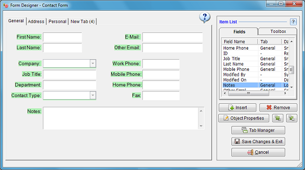
This window displays the list of all fields existing in current catalog on top right side.
Show Field Label: Uncheck this box to hide the field label from record window. Most useful when there is no need to display the field label or when you want to replace it with a customized label object from the toolbox.
Displayed: Allows you to temporarily make some toolbox objects invisible without deleting them. This option is not shown for data field objects. If you want to make a data field invisible without deleting, select it and then click "Remove" button.
Auto Expand to Right / Bottom: Fields with certain data types allow to expand automatically to the right or bottom in order to fill the available space on record forms. It is most useful for long text fields, as they will enlarge to display as much of their content as possible when you maximize the record window.
Back Color: Sets background color of the data field. By default, this color is set as light yellow for computed fields, light blue for encrypted fields and white for all others.
Alignment: Sets the text alignment of the data field. This alignment only applies to record forms. If you want to modify the column alignment in tabular views, you must set it from Field Properties window.
Text Color: Sets the text color of a data field, label object or action button. Default: Black.
Custom Font: The default font properties used for data display everywhere is set from Preferences window. If you want to customize font for a specific data field or other object, you may check this box and then set a custom font.
Border Width & Color: Determines the border width and color of a shape, picture or label object.
Transparent: Determines whether a label or shape object has a solid background color or displayed transparently.
Field Label: Allows you to set any preferred display name for the selected data field. Modifying the field's display name does not affect the actual object name assigned for that field. This name can also be set from Field Properties window.
Form Alignment: Allows you to align the object with respect to the preferred side of the window.
e.g. If an element is set to align with respect to right side of the window, its distance will remain fixed when the
record window is resized or maximized.
This selection must be set as "Left, Top" unless your design requires otherwise and you truly understand
how it affects object locations.
Mouseover Tip: Allows you to assign a tip for the selected object which will be displayed as a popup box when the user moves mouse over the object. Applies to multiuser licenses.
Object Name: You may optionally assign an object name for the selected object. Object names can then be referred by scripts for various actions. Object names of data fields can only be modified from Field Properties window.
Use the "bring to front" or "send to back" buttons to arrange the overlapping behavior of the objects.
Shape Objects: Lines, rectangles and other shapes can be used as decorative objects or to mark important elements on the form.
Labels: Labels can be used as headers to separate data fields into multiple groups, to display informative or warning messages. The label text can also be set dynamically by script objects.
Pictures: You may display static images like your company logo on all record windows.
Action Buttons: Action buttons can be used to execute a script procedure. The script can then do the task whatever it was designed for, e.g. checking all data entries for consistency and warn the user if necessary, opening a web browser window to Google search data retrieved from the record window etc.
Script Objects: These objects are invisible on the form and execute a procedure whenever a specific
event happens, e.g. when the record is opened or saved.
See Script Editor for more information.
Form Tab Orders: You may here create new tabs, delete unused ones and rename them. Use the up/down arrow buttons to change the order of tabs. This will allow you to move all form items on a form page to another.
Field Navigation Order: This section allows you to precisely adjust the order of cursor navigation whenever you press the "tab" key while editing a record. This helps users to enter data more efficiently without using the mouse.
Important! If you create a new tab page, but exit form designer without inserting any data or toolbox item into this new tab, the tab will automatically be deleted! You should place at least one object into the empty tab if you want to keep it.
Save Changes & Exit: Saves all changes to the database and closes the form designer.
Cancel: Cancels all changes you have made and closes the form designer.